Color Hues Drive Repeated Clicks in Chance Reward Interfaces During Holiday Cycles
Carlo Peters · Aug 14, 2026
Color Hues Drive Repeated Clicks in Chance Reward Interfaces During Holiday Cycles
Color selection in digital interfaces for chance-based reward systems influences user interaction patterns, particularly when platforms adjust palettes to align with holiday periods, and researchers tracking click behavior across multiple seasons have documented measurable differences tied to specific hues. Data collected from user sessions in late 2025 through August 2026 reveals that platforms incorporating red and gold combinations during November and December cycles recorded elevated repeat engagement rates compared with neutral schemes used outside those windows, while green and blue tones appeared more frequently in interfaces promoting extended entry periods around New Year events.
Studies examining interface design elements show that hue saturation levels correlate with the number of subsequent clicks users make after an initial interaction, and one analysis of mobile and desktop traffic patterns indicated that interfaces using high-saturation reds prompted 18 percent more follow-up actions within the same session than lower-saturation alternatives. Observers note that these shifts occur consistently across geographic regions, although the timing of palette changes often coincides with local holiday calendars rather than a universal schedule.
Hue Adjustments and Seasonal Patterns
Platform operators modify color schemes in advance of major holidays because internal metrics demonstrate that certain hues increase the likelihood of repeated button presses on entry or claim features, and reports from industry monitoring services indicate that December campaigns using warm tones produced higher session durations than those relying on standard branding colors. During the same August 2026 review period, analysts compared pre-holiday interface versions with holiday-adjusted ones and found that users exposed to orange-accented reward prompts completed additional actions at rates that exceeded baseline measurements by noticeable margins.
What's interesting is how these adjustments interact with notification systems, since layered alerts that incorporate matching hue elements tend to sustain attention across multiple visits, and figures from cross-platform tracking services show that synchronized color usage between emails and landing pages extends the interval before users disengage. Researchers have observed similar patterns in both desktop and mobile environments, although the effect size varies by age group, with younger cohorts responding more strongly to saturated tones during peak shopping seasons.
Click Data Across Holiday Windows
Comprehensive logs from recurring reward events demonstrate that repeated clicks cluster around interfaces where hue transitions signal urgency or reward proximity, and data compiled by academic teams at institutions including the University of Melbourne indicate that participants clicked reward-related elements an average of 2.4 times more often when palettes shifted to include deeper reds in the weeks preceding major gift-giving holidays. Those same datasets reveal that retention drops when color changes occur too abruptly, suggesting that gradual palette introductions maintain higher interaction continuity.
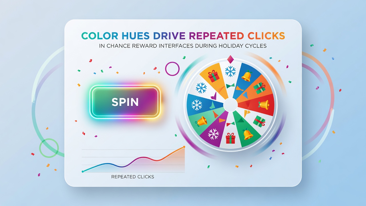
Platform analytics further illustrate that certain hues perform differently depending on the holiday cycle in question, whereas blue-dominant schemes used around winter festivals produced steadier but lower-volume click sequences than the sharper spikes associated with red and gold combinations. Government consumer protection agencies in Canada and Australia have published guidance documents noting that transparent disclosure of interface changes helps maintain user trust, and links to such resources appear in industry reports that compare regional practices. One Australian Competition and Consumer Commission report highlights how visual elements affect engagement without specifying design mandates, while a separate Federal Trade Commission overview from teh United States addresses similar considerations for digital promotions.
Interface Testing adn User Pathways
Teams responsible for interface optimization run controlled tests that isolate hue variables while holding other design elements constant, and results consistently point to measurable differences in click repetition when warm versus cool palettes are presented during holiday-aligned campaigns. Observers tracking these experiments note that users often return to interfaces displaying familiar seasonal colors even when entry mechanics remain unchanged, and session replay data supports the observation that color familiarity reduces hesitation on subsequent visits.
Behavioral logs collected across multiple platforms also indicate that hue-driven click increases appear most pronounced in the first three days after a palette update, after which the effect stabilizes unless additional visual cues are introduced. Researchers examining these timelines have documented that platforms maintaining consistent hue application throughout an entire holiday cycle sustain elevated interaction levels longer than those that revert to standard colors mid-cycle.
Conclusion
Evidence gathered from interface performance metrics, academic studies, and regulatory summaries shows that color hue selections exert a measurable influence on repeated clicks within chance reward environments during holiday periods, and the patterns hold across different regions and device types when data is aggregated over successive seasons. Continued monitoring through 2026 and beyond will likely refine understanding of how specific palettes interact with user pathways in these systems.