Examining Visual Design Influences on Completion Rates During Online Prize Entry Sequences
Eden Hayes · Jul 26, 2026
Examining Visual Design Influences on Completion Rates During Online Prize Entry Sequences
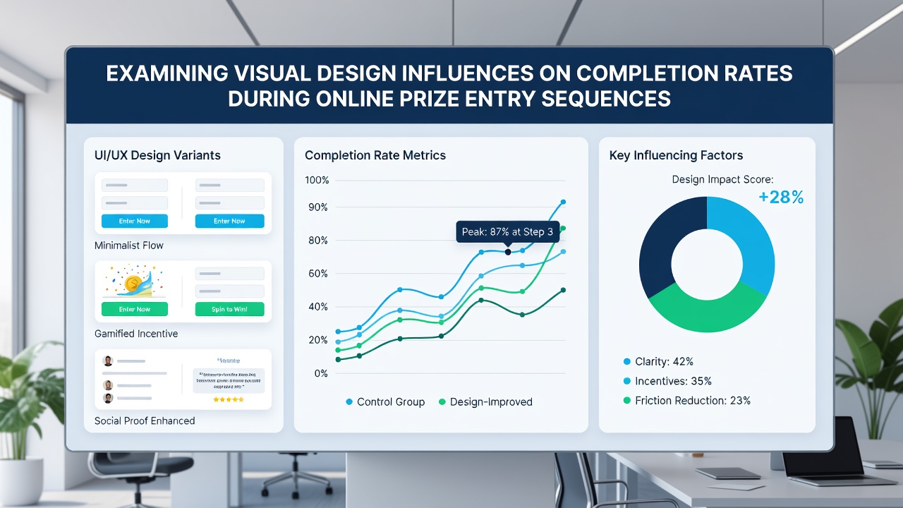
Online prize entry sequences rely on visual design elements that guide participants through forms, and researchers have documented measurable shifts in completion rates tied to these choices. Color palettes, button styles, layout spacing, and image placement all interact with user behavior during registration steps for sweepstakes and similar promotions, while data collected across platforms shows consistent patterns in how these factors influence whether people finish the process or abandon midway.
Color Choices and Form Progression
Studies indicate that high-contrast color combinations on entry pages increase the likelihood of form completion because they direct attention toward required fields without overwhelming the viewer. Warm tones applied to submit buttons correlate with higher interaction rates in several tracked campaigns, whereas cooler background shades help maintain focus during longer sequences that ask for multiple pieces of information. Observers note that muted palettes sometimes reduce visual fatigue when entrants encounter repeated steps, and this effect appears stronger in mobile views where screen real estate limits options.
Button Design and Immediate Response Rates
Button size, shape, and placement play direct roles in completion statistics. Rounded corners on action buttons have shown modest gains in click-through data compared with sharp edges, while ample white space around these elements prevents accidental taps on smaller devices. Research indicates that buttons positioned at the natural scroll endpoint rather than floating headers maintain momentum through the entry flow, and this positioning matters most when sequences require address verification or email confirmation stages.
Typography and Readability Effects
Font selection and line spacing influence how quickly users parse instructions and legal disclaimers that accompany prize promotions. Sans-serif typefaces at moderate sizes improve legibility on both desktop and mobile screens, leading to fewer drop-offs during the review phase of an entry. Data shows that excessive font-weight changes within a single form can create hesitation, whereas consistent hierarchy allows participants to scan required versus optional fields efficiently.
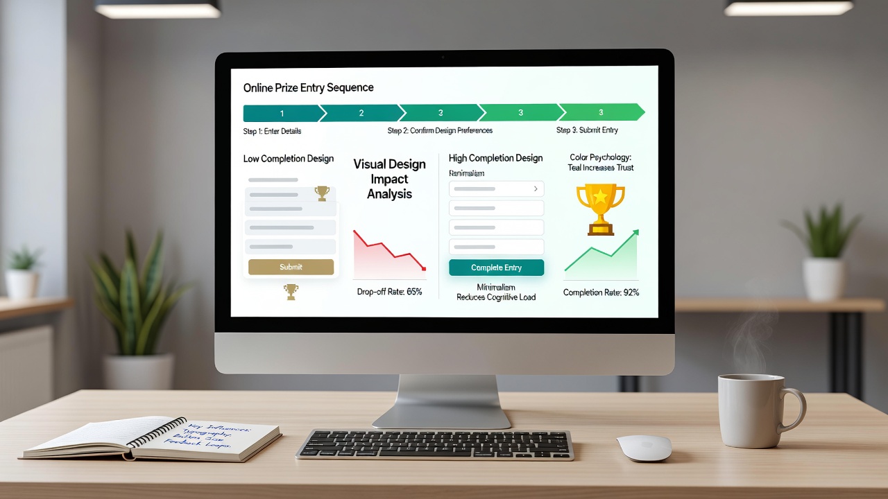
Animation timing also factors into these outcomes. Subtle progress indicators that update without delay keep users oriented, but overly elaborate transitions have been linked to increased exit rates in controlled tests. Those who study interface behavior report that loading animations under one second maintain engagement through multi-step forms, while longer delays prompt abandonment regardless of prize value.
Mobile Layout Adjustments and Cross-Device Patterns
Responsive design adaptations prove critical because most prize entries now occur on smartphones. Vertical stacking of form fields with touch-friendly targets reduces friction compared with layouts that require horizontal scrolling. Evidence from platform analytics reveals that entries started on tablets show different completion curves than those begun on phones, particularly when visual elements resize dynamically rather than remain fixed. In July 2026, several large promotion operators recorded measurable lifts after implementing adaptive grids that prioritized single-column layouts on smaller viewports.
Imagery Integration and Distraction Levels
Background images and hero visuals can either support or hinder progress depending on their opacity and placement relative to input areas. Low-opacity overlays behind text fields maintain brand presence without obscuring labels, and this balance appears in higher completion figures across repeated campaigns. Researchers have found that prize-related photography placed above the fold encourages continuation when it aligns with the entry theme, whereas unrelated stock imagery sometimes increases bounce rates at the first field.
According to findings published by the Nielsen Norman Group, visual hierarchy directly shapes how users allocate attention across sequential screens in registration flows. Separate work from academic teams at the University of Melbourne has examined similar patterns in promotional interfaces, confirming that consistent iconography paired with clear labeling correlates with sustained completion through verification steps.
Conclusion
Visual design decisions accumulate across every screen of an online prize entry sequence, and aggregate data continues to map their collective influence on whether participants reach the final confirmation. Adjustments to color, typography, spacing, and interactive elements produce measurable differences in completion statistics, while ongoing platform monitoring supplies fresh datasets that refine these observations over successive promotion cycles.