The Hidden Influence of Palette Selection on User Actions in Chance-Based Online Reward Systems
Rafael Walter · Jul 1, 2026
The Hidden Influence of Palette Selection on User Actions in Chance-Based Online Reward Systems
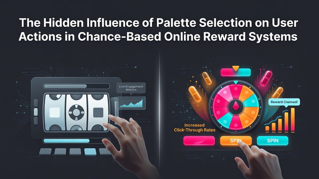
Color choices in digital interfaces extend far beyond decoration since they shape how participants interact with chance-based reward platforms through subconscious cues that affect entry rates and decision patterns. Research in visual psychology demonstrates that specific hues trigger measurable shifts in user engagement when applied to buttons, backgrounds, and notification elements within these systems.
Core Mechanisms of Color Impact
Platforms deploy palettes that align with established findings on attention and trust, where cooler tones like deep blues and teals often appear in registration flows to promote sustained interaction while warmer accents such as oranges draw focus to action prompts. Studies conducted across multiple interfaces reveal that altering saturation levels alone can change click-through patterns by directing eye movement toward or away from entry fields during peak usage hours. Observers note that these adjustments occur most frequently in systems handling recurring prize events because small modifications scale across large user bases without requiring structural changes to the underlying mechanics.
Regional and Demographic Patterns
Data collected from international deployments indicates that palette preferences vary by audience location and age bracket, with European users responding more readily to muted earth tones in promotional banners whereas North American groups show higher interaction with high-contrast combinations. In July 2026 several operators adjusted their color schemes based on aggregated analytics that tracked form completion rates across mobile and desktop environments, confirming that older participants favored less saturated options that reduced visual fatigue during extended browsing sessions. Those who examined cross-platform records found correlations between palette consistency and repeat visits, particularly when systems synchronized hues across email notifications and landing sequences.
Practical Applications in Interface Design
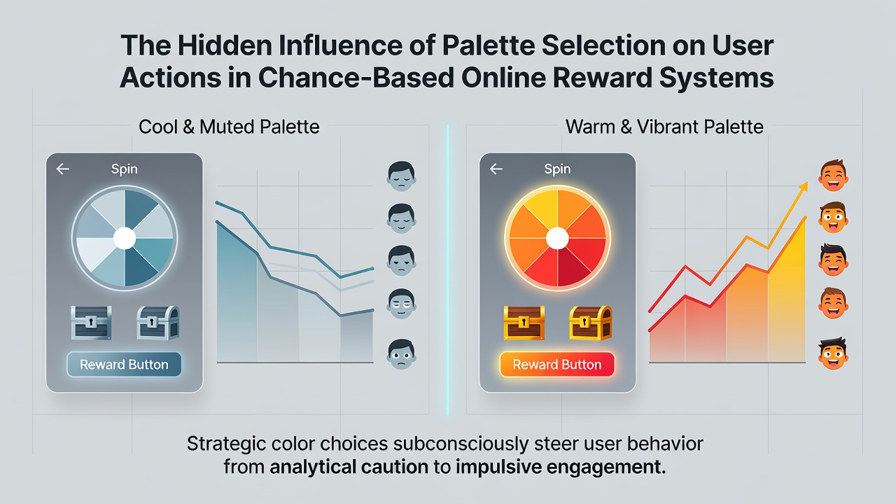
Design teams implement A/B testing protocols to isolate palette effects from other variables such as text placement or reward value displays, and findings from these tests consistently show that strategic use of accent colors increases progression through multi-step entry processes. For instance, one analysis of reward platforms documented that replacing neutral grays with targeted greens in confirmation stages led to measurable improvements in submission accuracy across different device types. Industry reports from regulatory bodies like the Australian Competition and Consumer Commission emphasize transparency in visual design elements to ensure participants understand system mechanics regardless of color-driven prompts.
Measurement and Ongoing Adjustments
Analytics frameworks now incorporate color metrics alongside traditional performance indicators, allowing operators to monitor how palette shifts influence bounce rates and completion percentages over extended periods. Researchers at institutions such as University of Colorado have contributed datasets showing that seasonal palette rotations can align with user behavior cycles, though results depend heavily on maintaining accessibility standards for colorblind participants. Those who review longitudinal data observe that platforms achieving balanced palettes sustain higher retention without relying solely on promotional incentives.
Conclusion
Palette selection functions as a foundational element within chance-based reward systems because it operates at the intersection of visual perception and behavioral response, influencing actions from initial discovery through final submission. Continued examination of these effects supports refinements that enhance clarity and accessibility across diverse user groups while aligning with established design principles.